Neat
14/Dec 2016
I had a chance to participate to the first ever beta launch event for a new bank app, last week in Hong Kong. Pretty much like for the other challenger banks out there, there were drinks, pizza, the founders and team there to answer questions and help explore the app, and lots of interesting people willing to talk and share their idea of how a bank should look like.
I don’t want to write another dull “unboxing” post explaining every single step/screen I went through, so here are the screenshots.
See you at the end of the page for some more blabber! :)
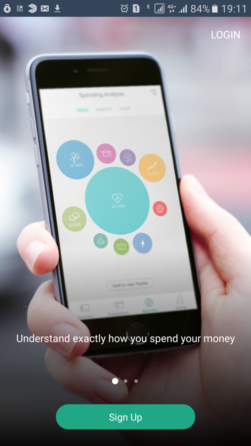
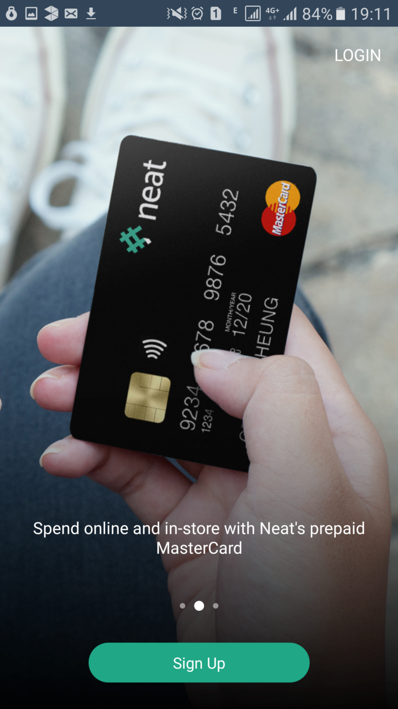
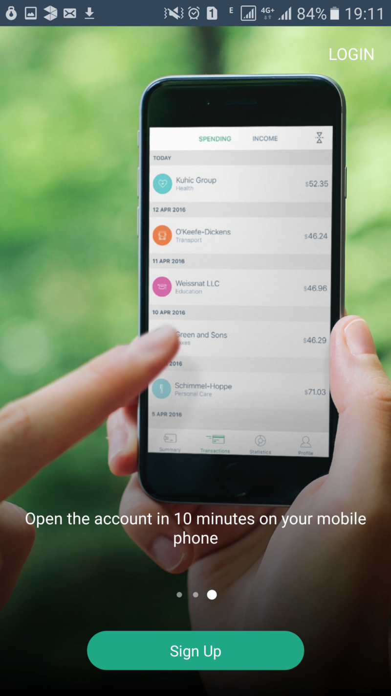
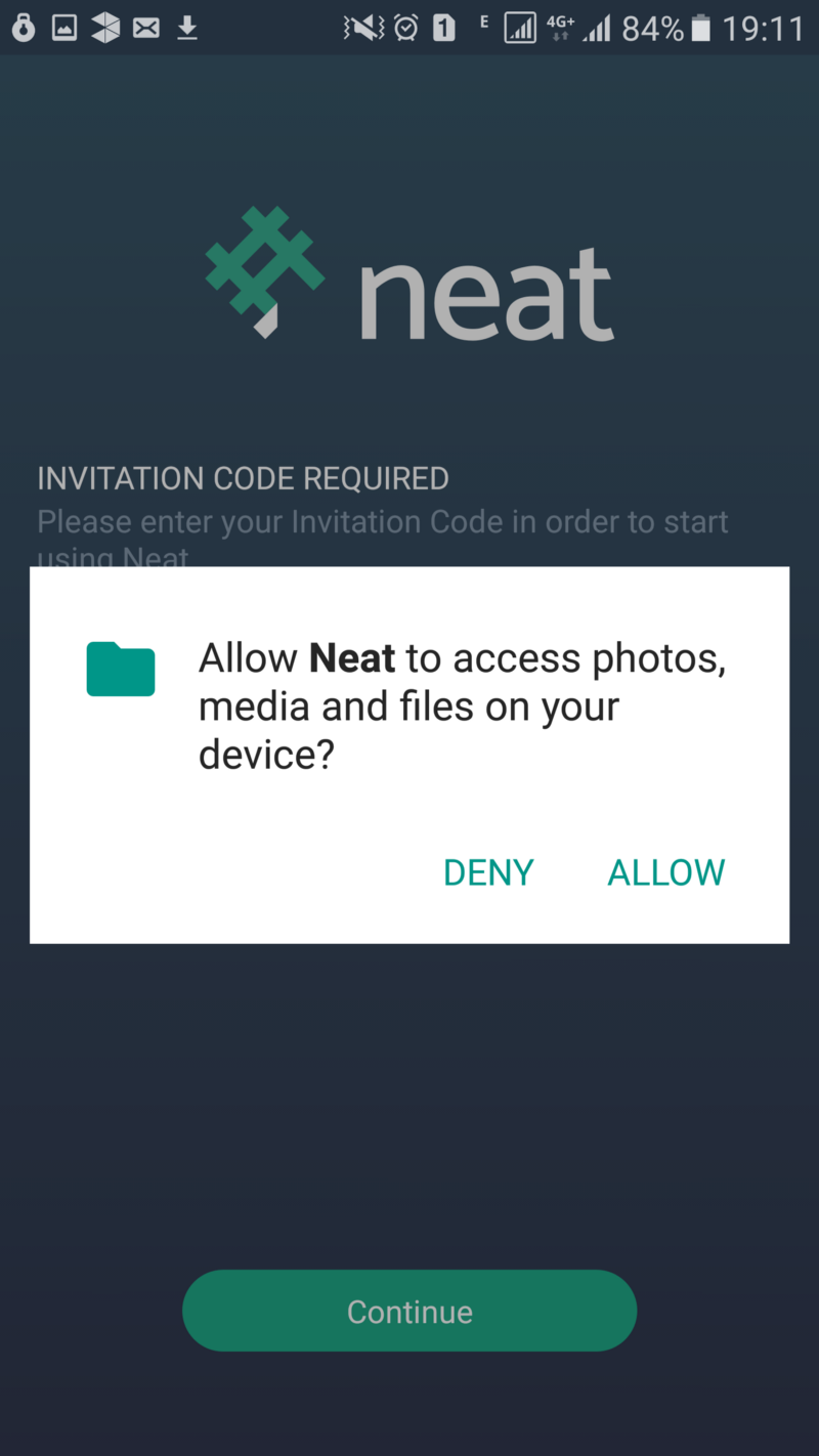
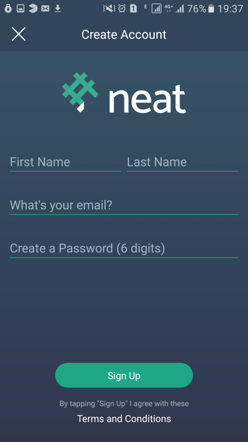
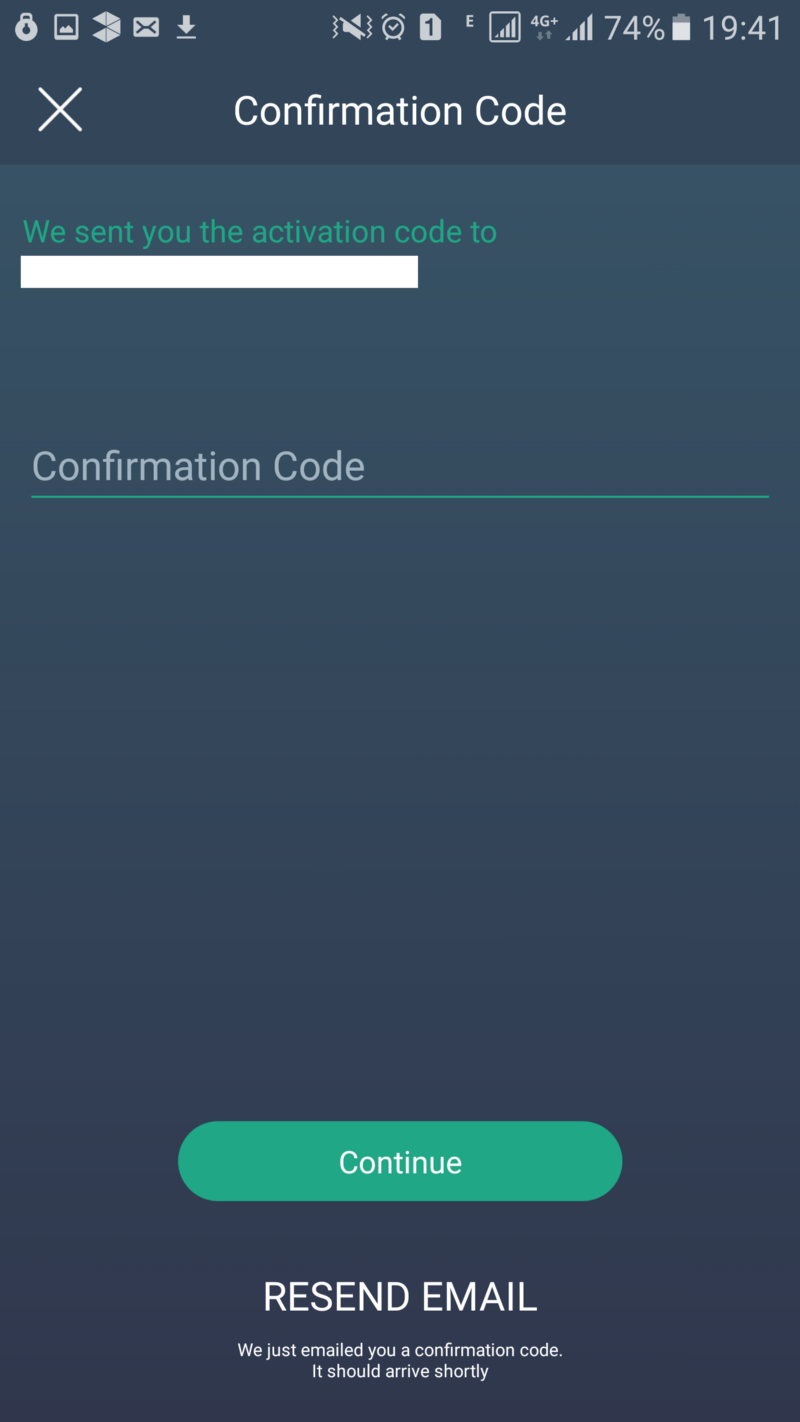
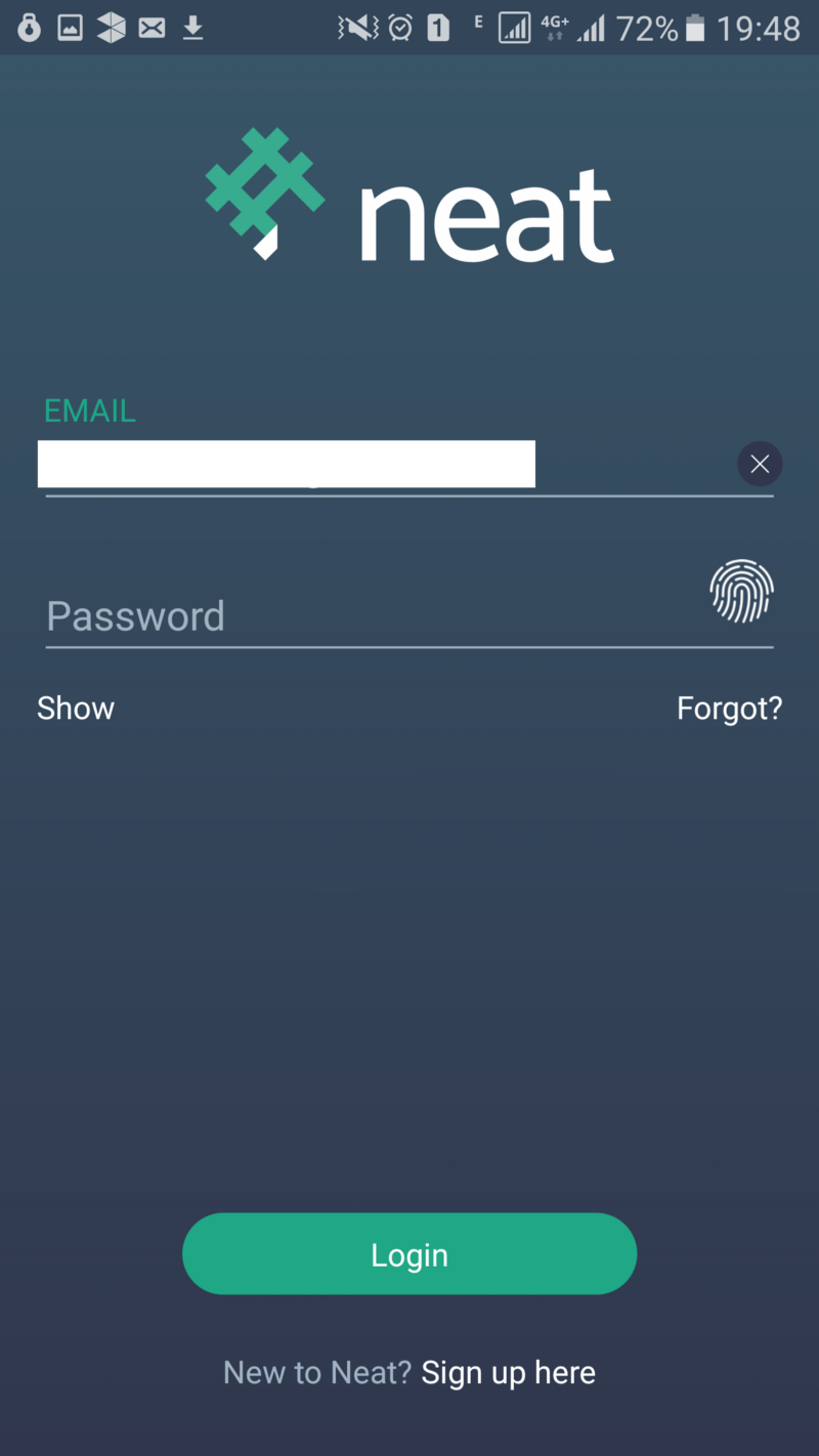
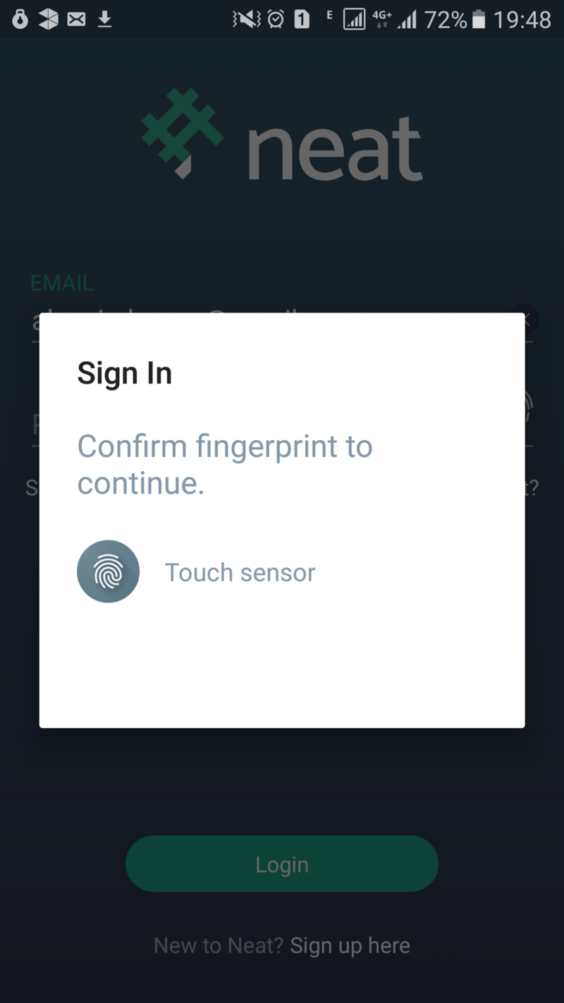
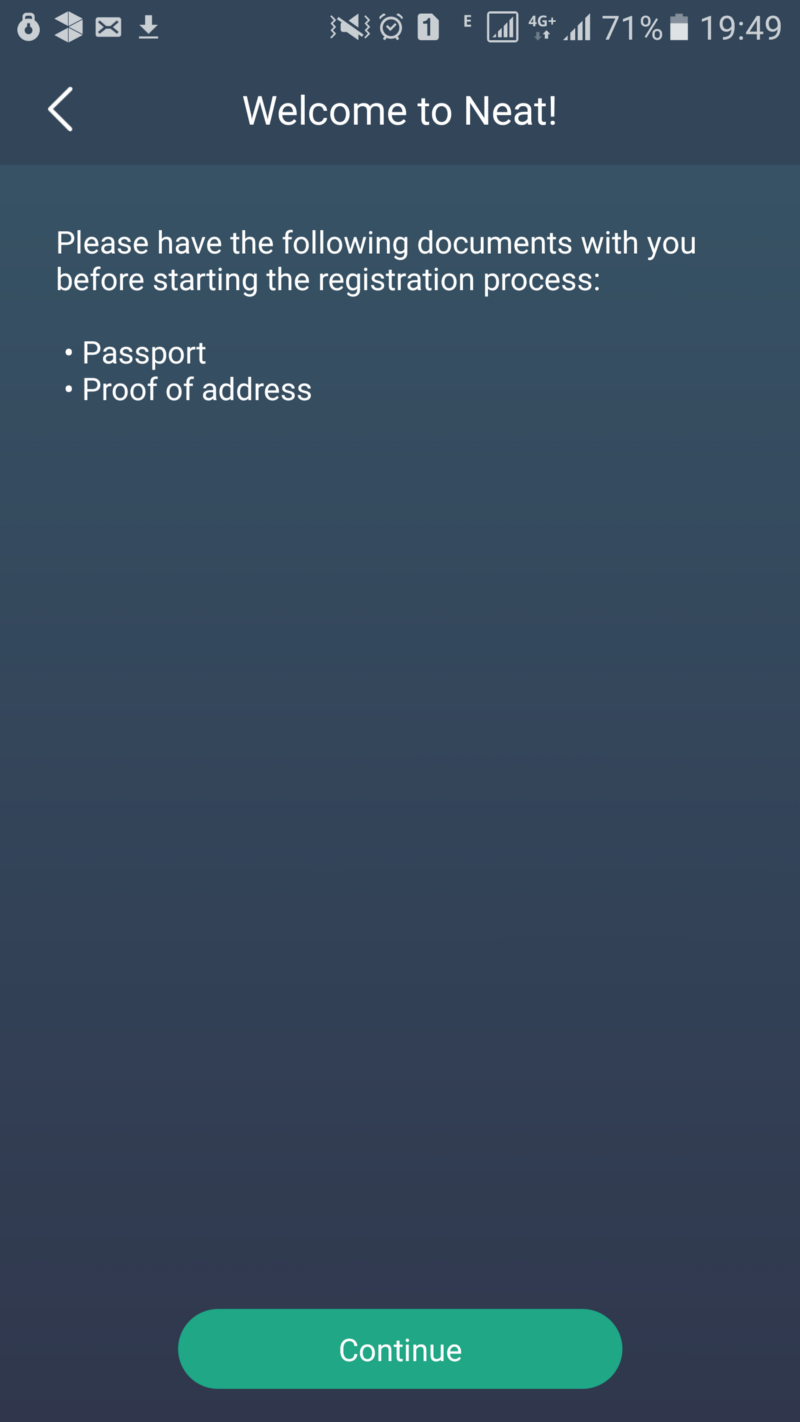
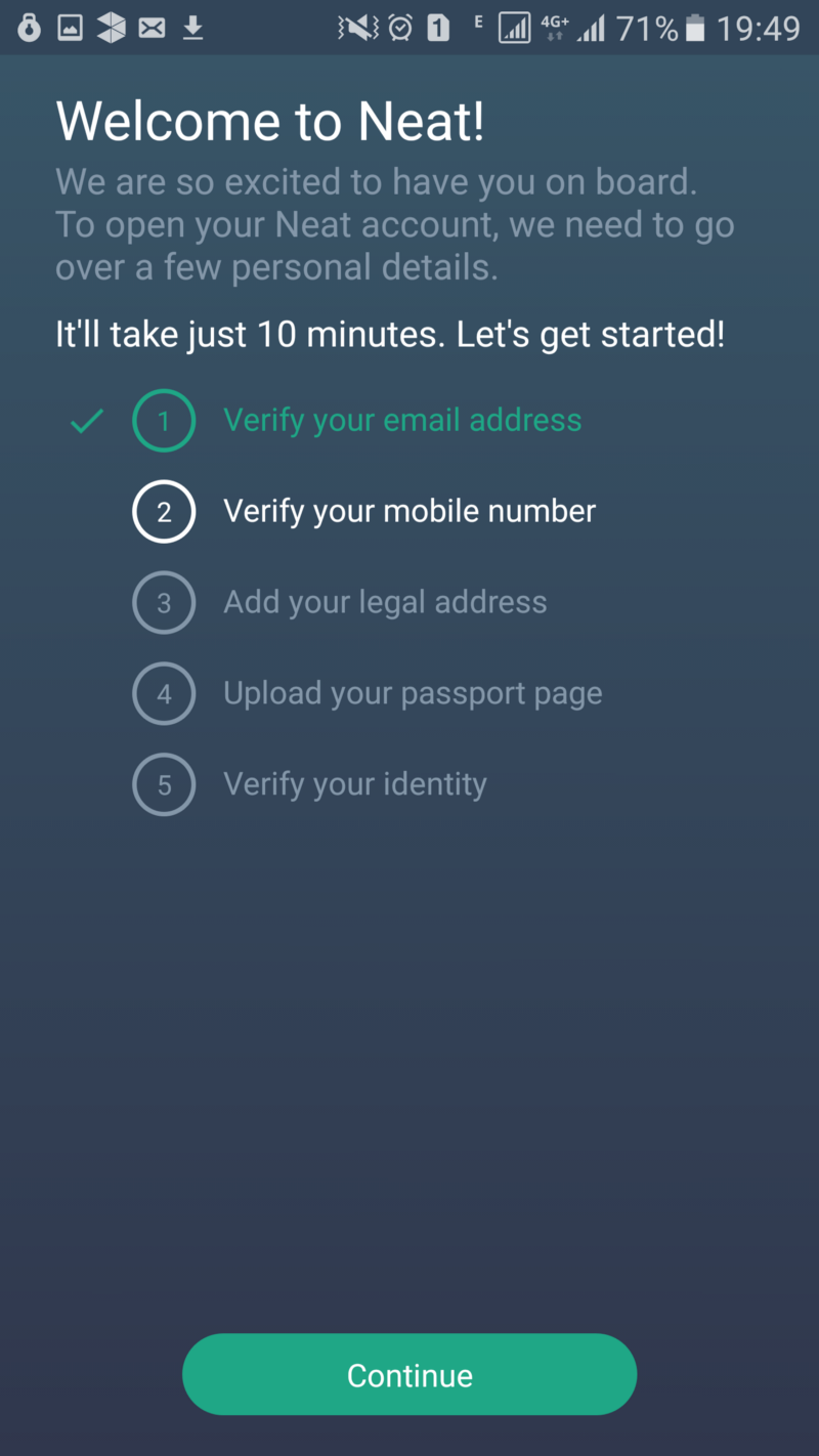
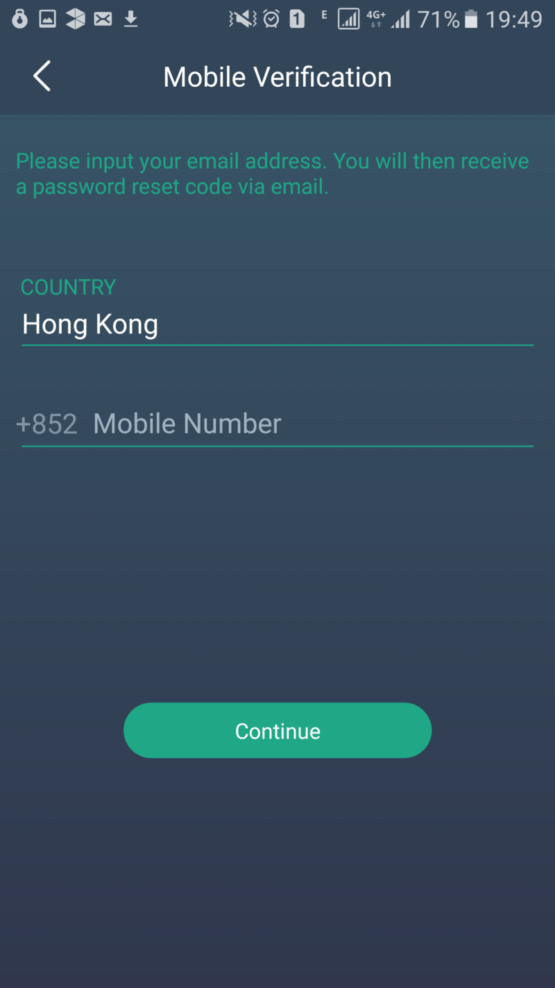
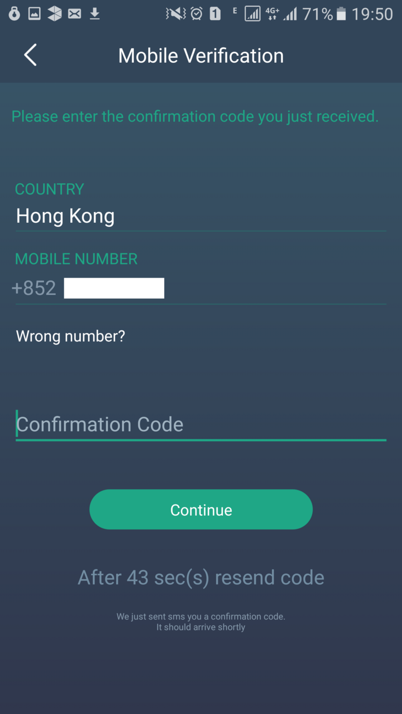
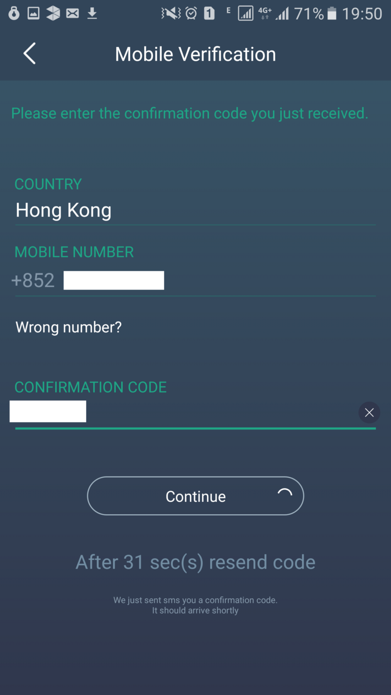
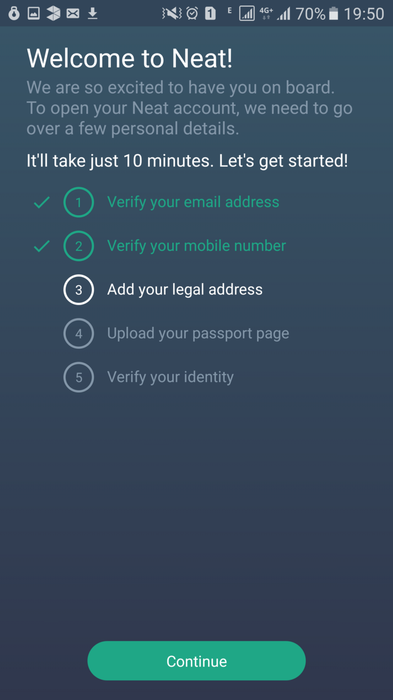
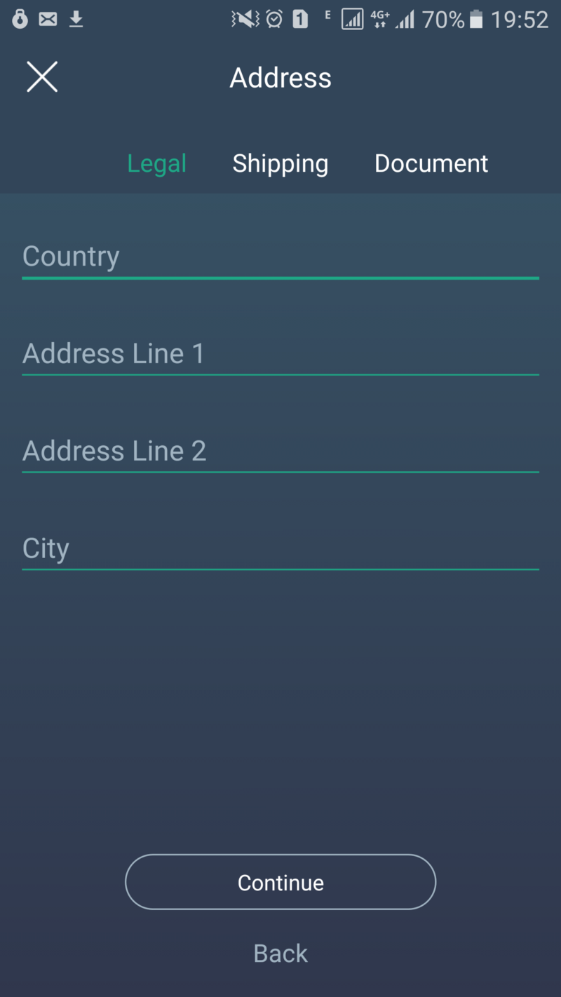
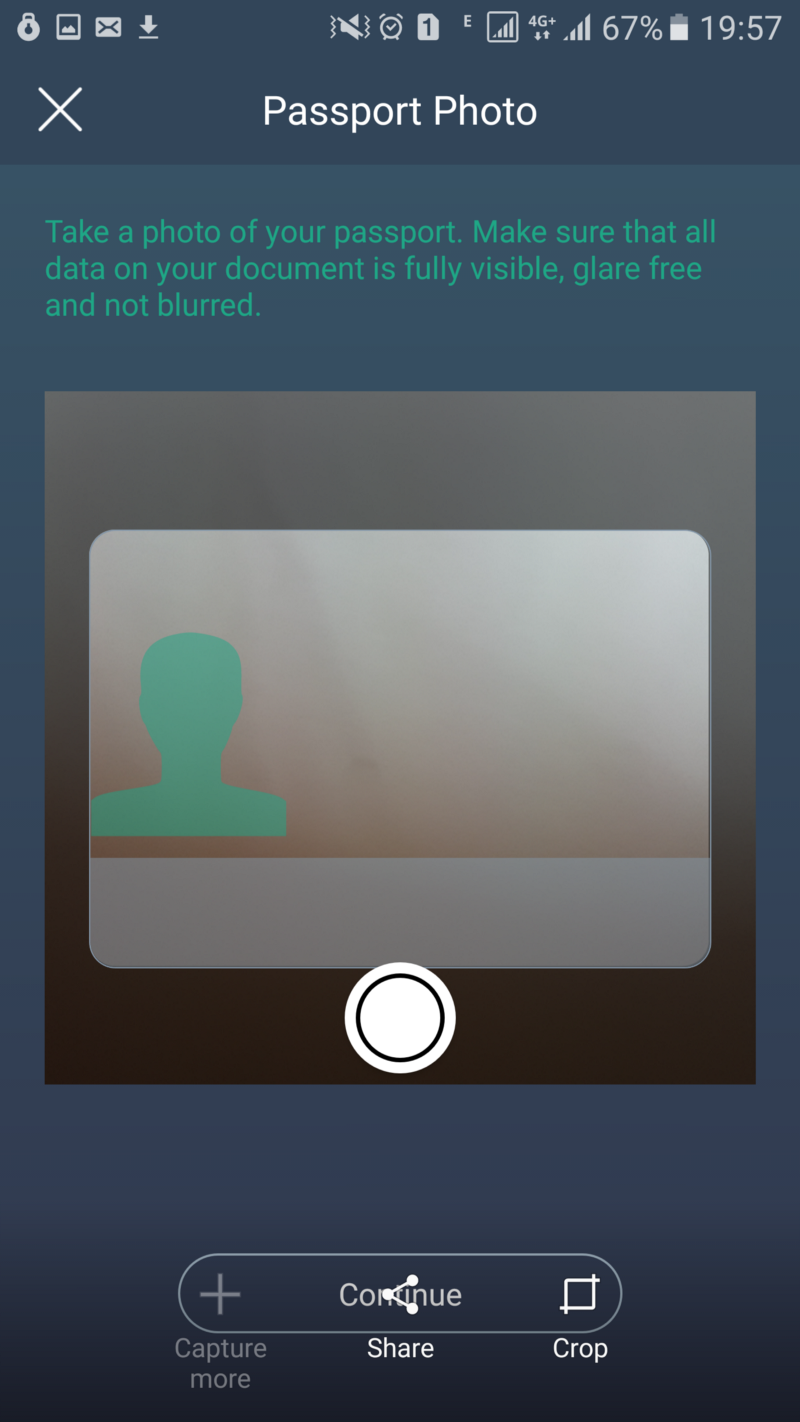
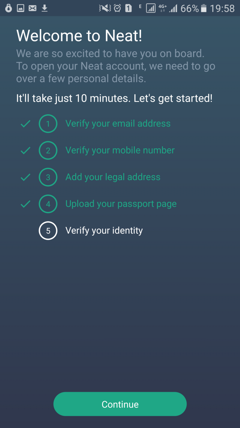
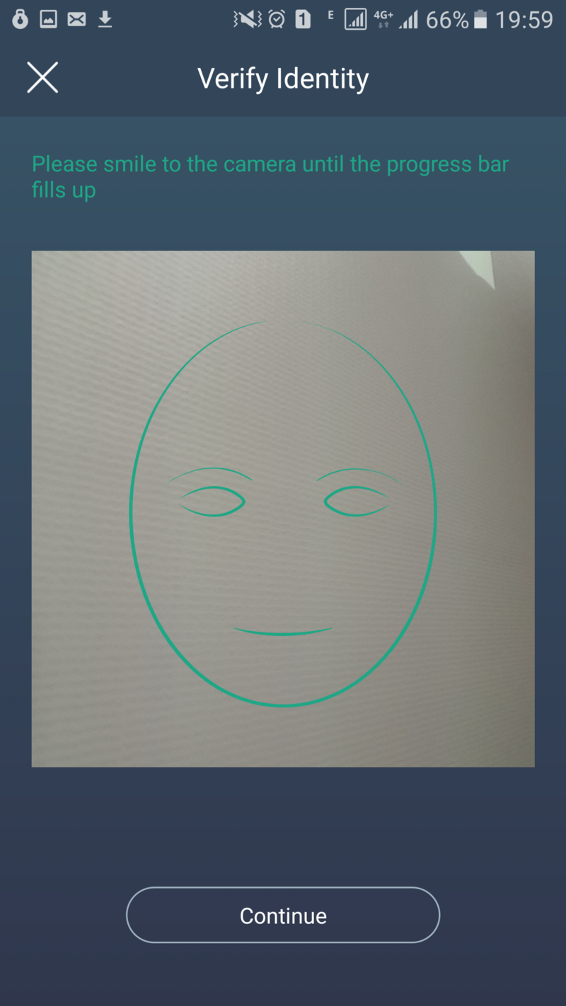
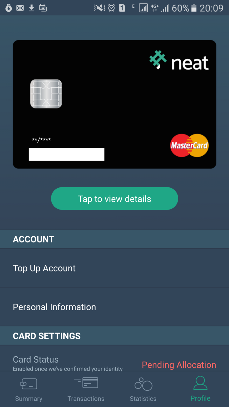
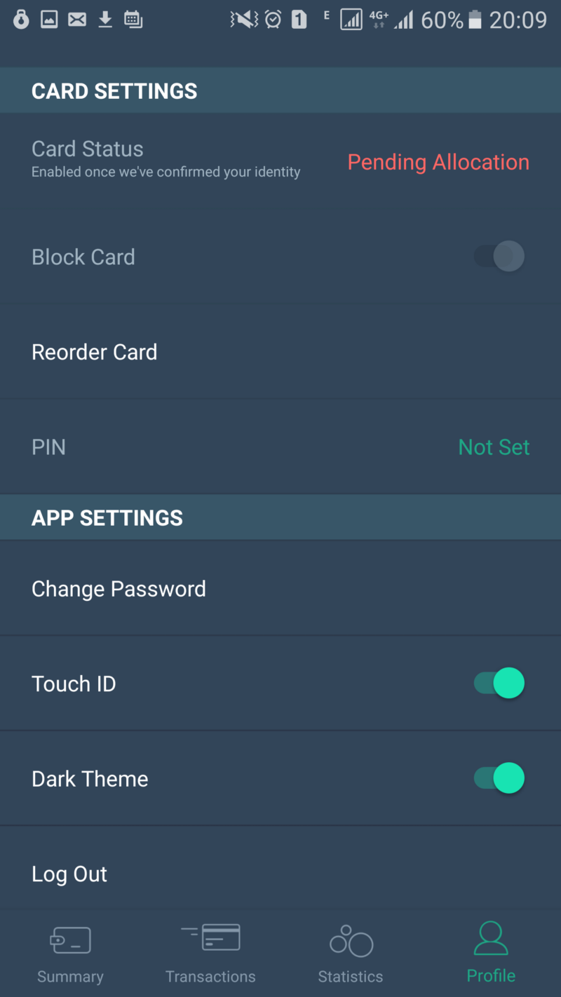
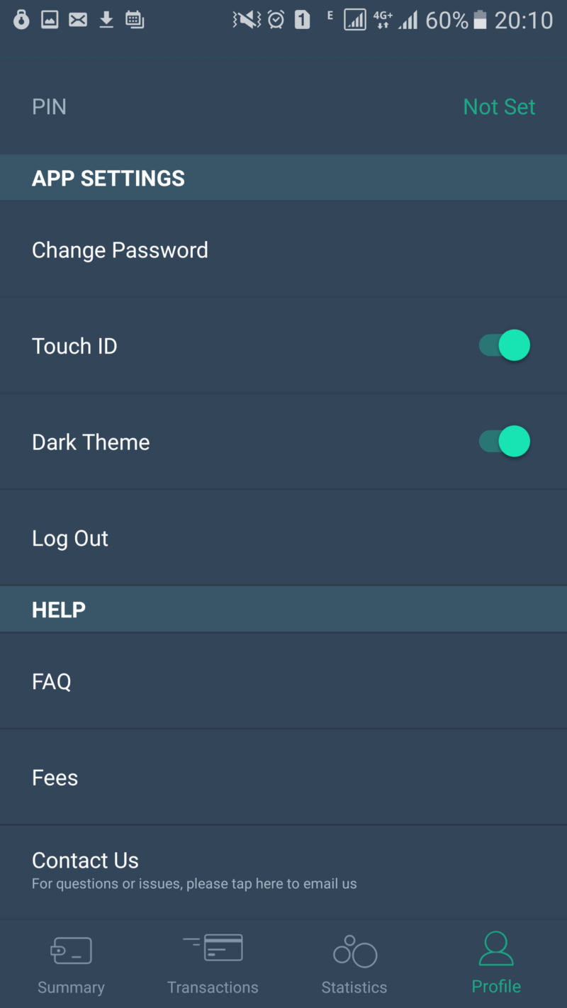
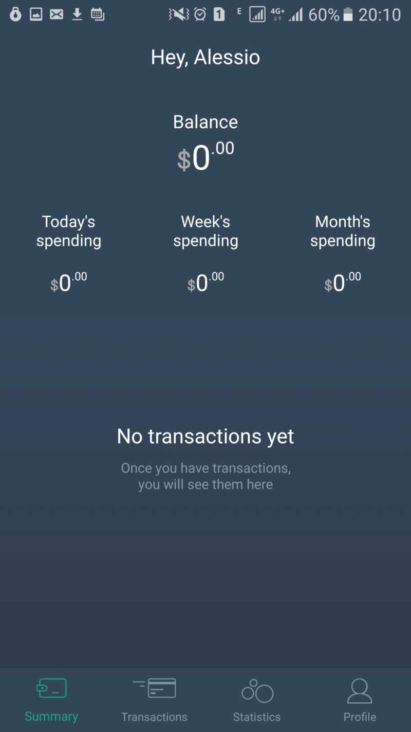
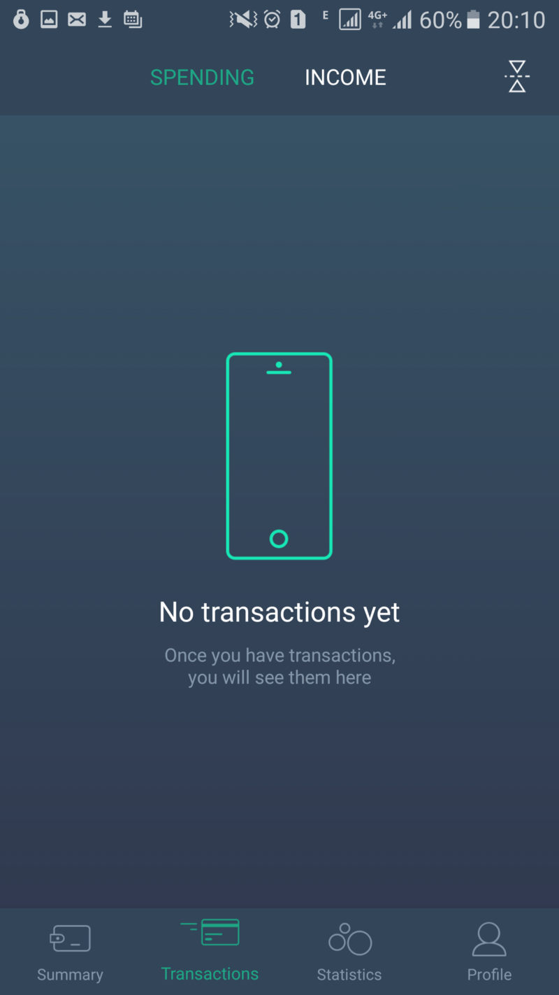
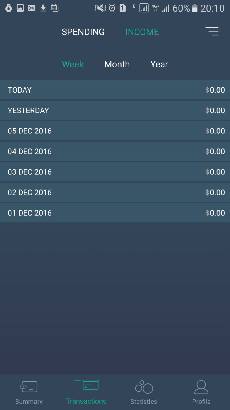
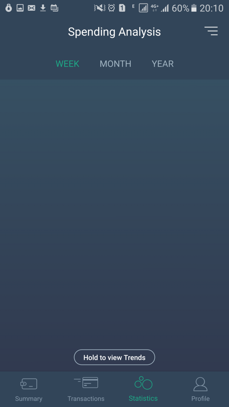
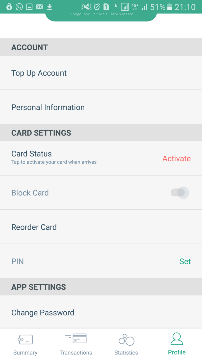
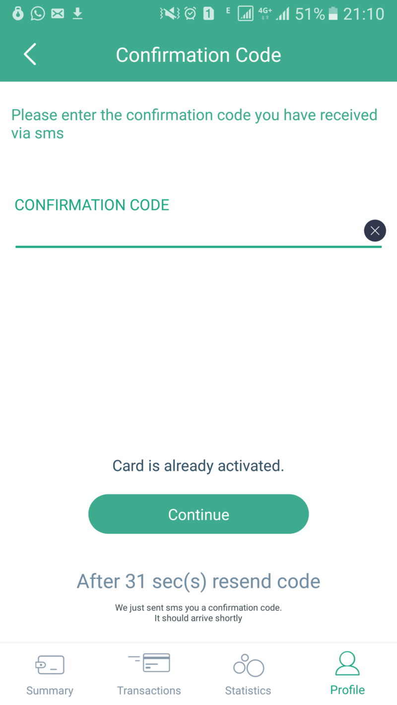
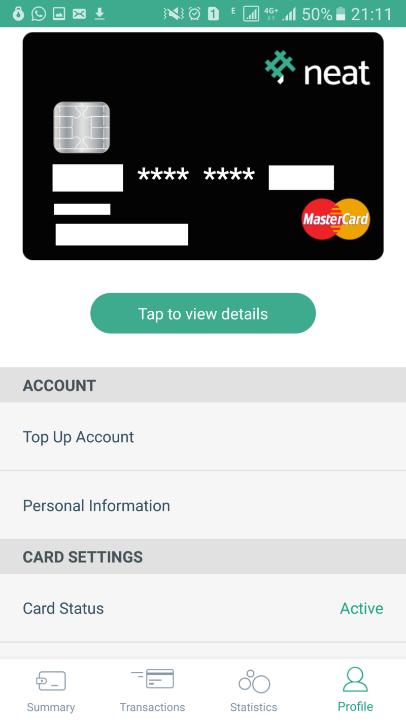
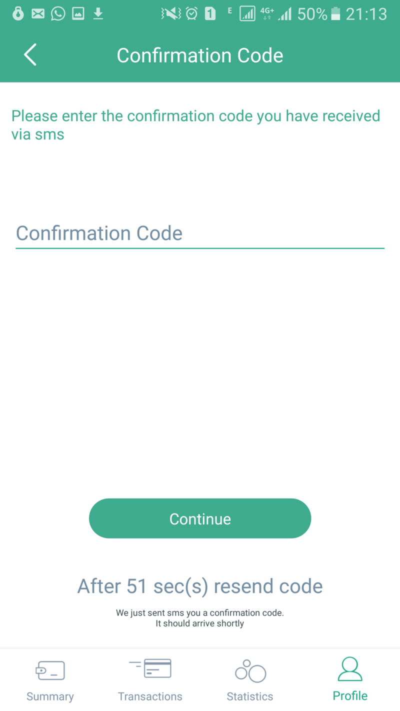
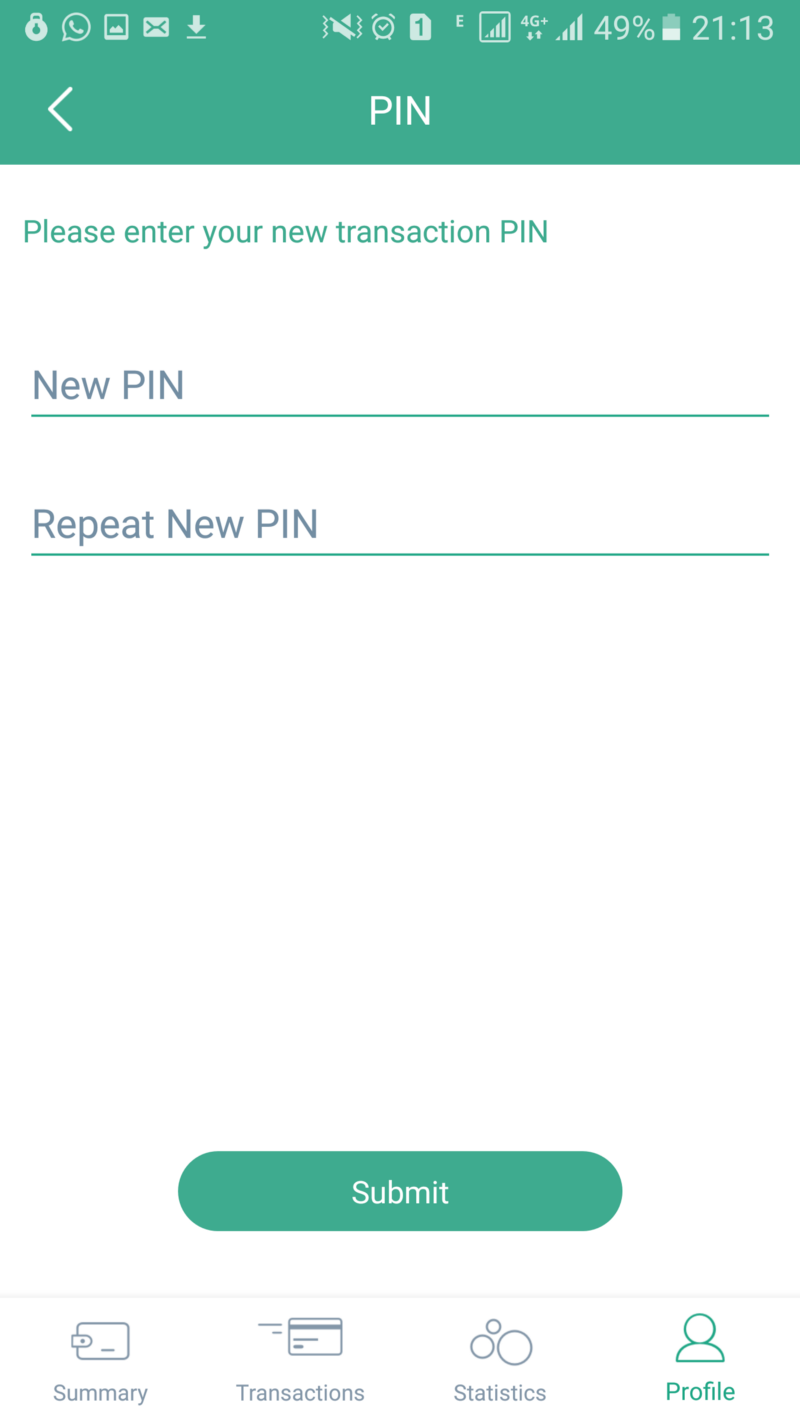
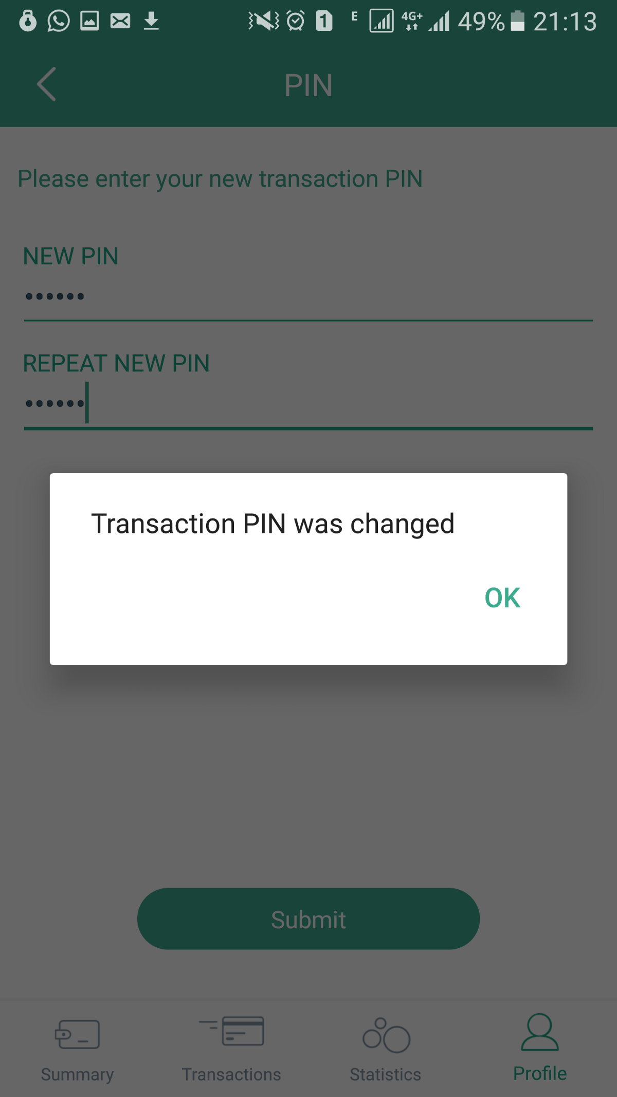
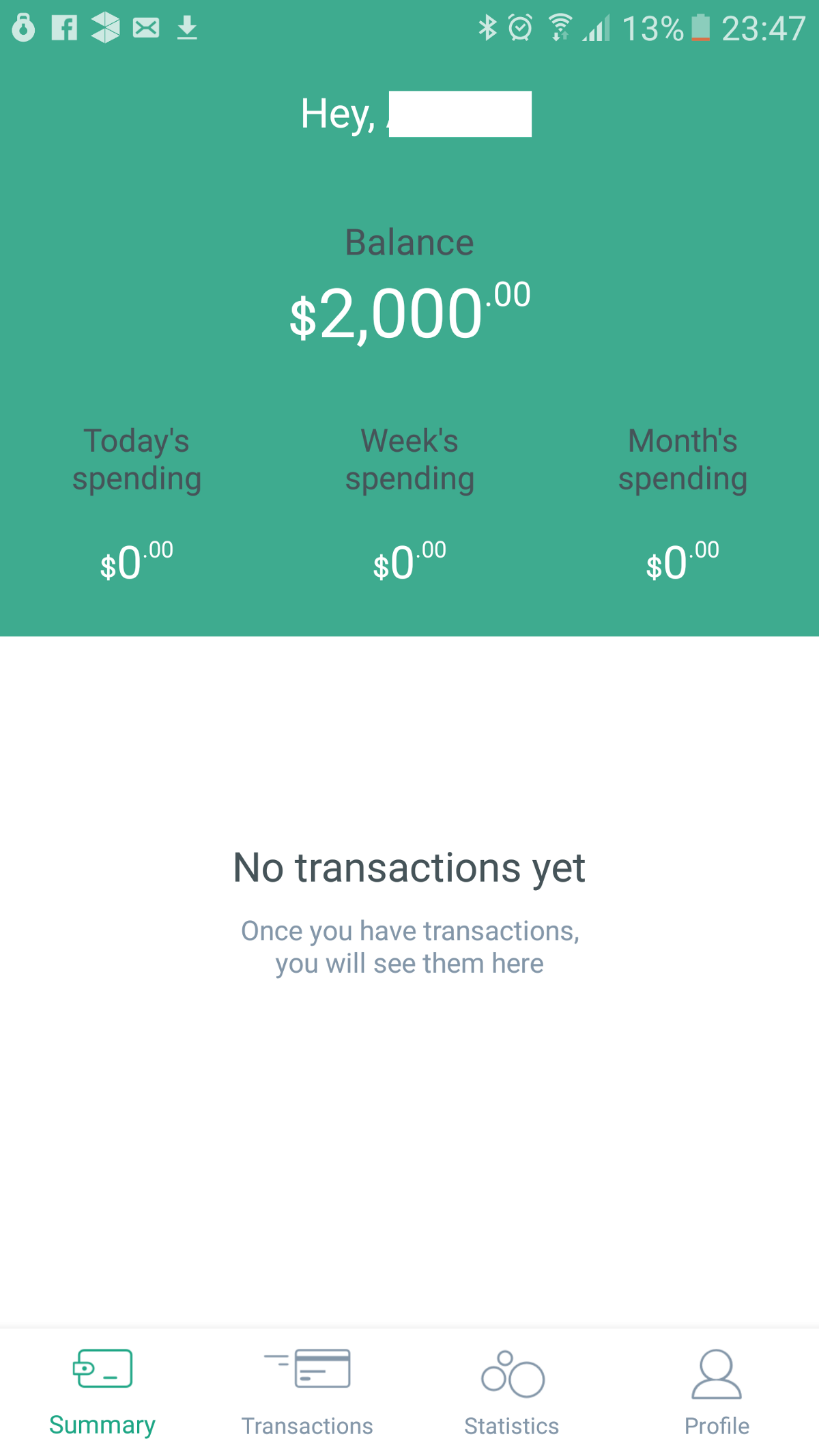
The onboarding was what you would have expected: some personal data, verify your email and phone, ID document, proof of address, and we had a “virtual” card already visible in our app that could be used to shop online.
A few considerations:
- They verify that your face matches the picture in the ID document. Implemented it in-house, not using a vendor for it… impressive!
- I like the “bubbles” tx summary screen, or at least the idea of it… the bigger the bubble, the more you spend in that category, so the more you should be looking at be restrained next time you are shopping. It is also useful to understand how much % of your spending is directed to which category.
- In real life though, you won’t spend the same amount of money for each category, so the bubble size will start to diverge… It may be interesting to use the view as a form of rudimentary “budget monitor”…setting multipliers for each category. If so, the goal would be to keep all bubbles roughly the same size… this would mean all is good budget-wise.
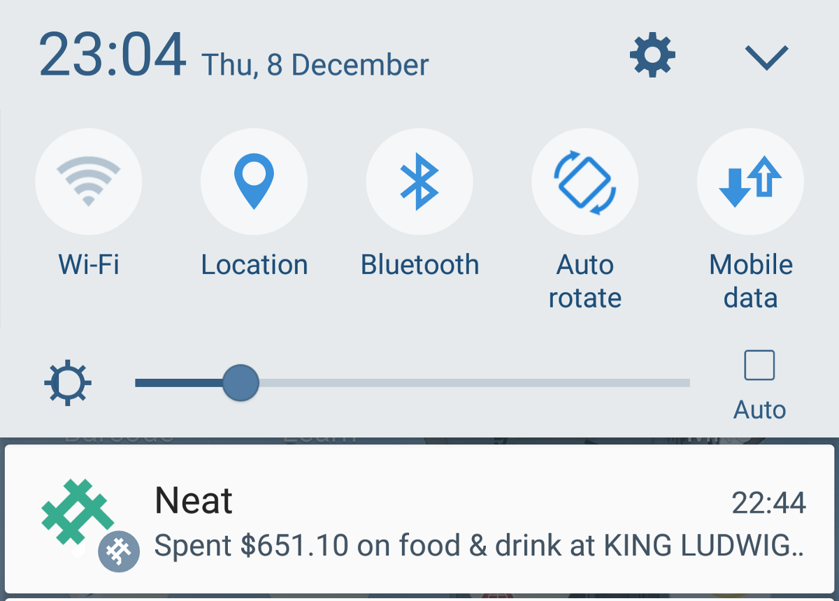
- they send SMS and push upon a tx - double notification. They received feedback in the first day or two, and already committed to remove the sms notification part. would be great to keep the option open though: when I travel abroad, I don’t have data, so it’d be nice if I could enable SMS to be notified of tx (and exchange rate, too!)
- Card was not working in some shops… but after feedback, it was fixed in no time. Good job team!
All in all, nice onboarding experience, the team cares about doing things well and they’re very open to feedback.
There is an online community where you can interact with the team, upvote features, etc…. seems that move money, p2p payments and additional spend control features are in the pipeline… eager to see them released.
Now if you excuse me, I’d go out and do some transactions to populate that Transaction Summary screen! ;)
