
A Website's restyling
30/Oct 2014
Last Sunday, Cathay Pacific launched a new restyling for its website. It looks modern while still elegant, and — most important, given the lacking of a mobile app to book flights — it looks good on a mobile.
I write “looks” good, because when you start using it, lots of small issues becomes evident. Let’s start from the beginning.
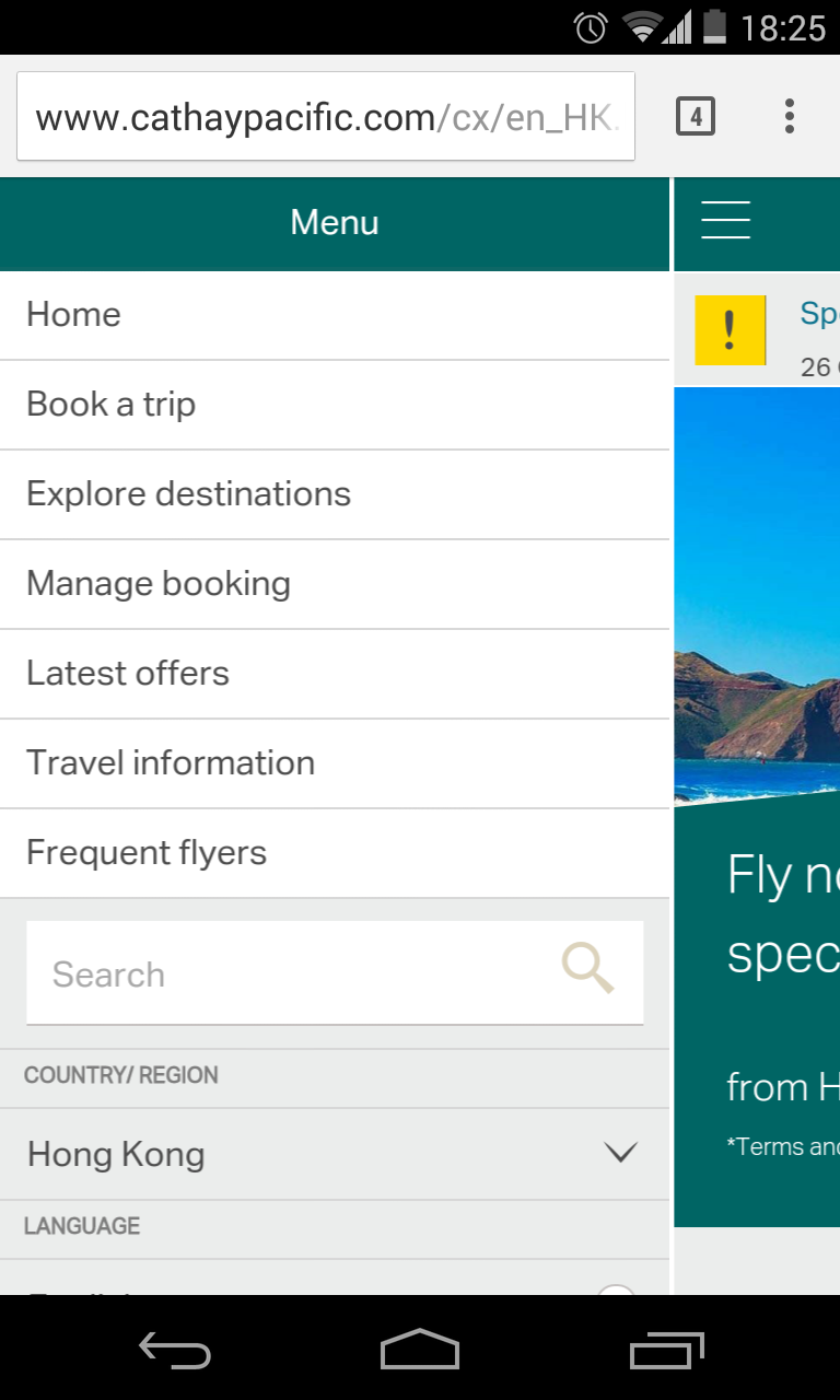
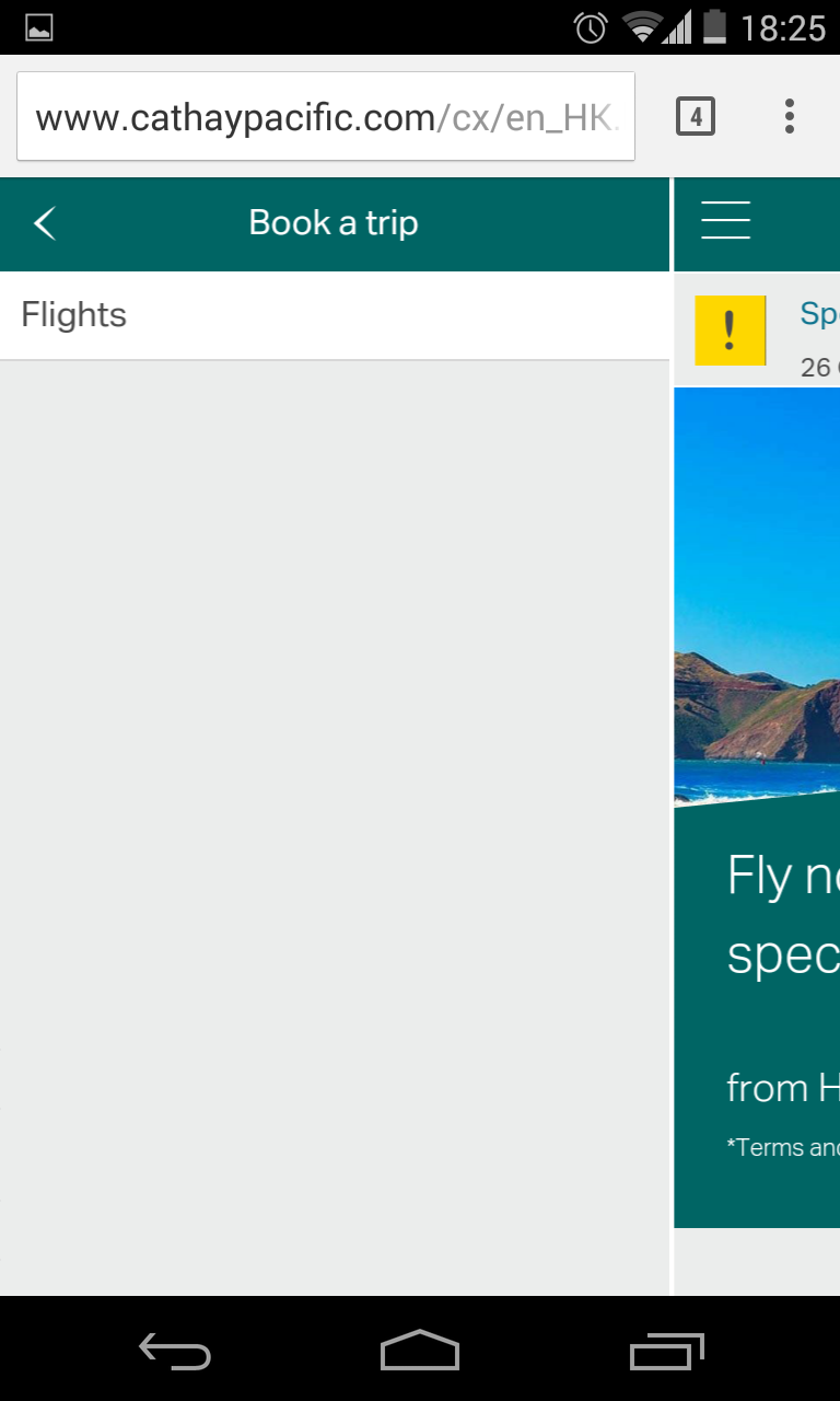
When I first open the home page, everything looks good. Side menu is mobile-y. Animation runs smooth. First slip are the links. When I decide to book something and then select flight (well, the only option), nothing happens. Missing link? Maybe…
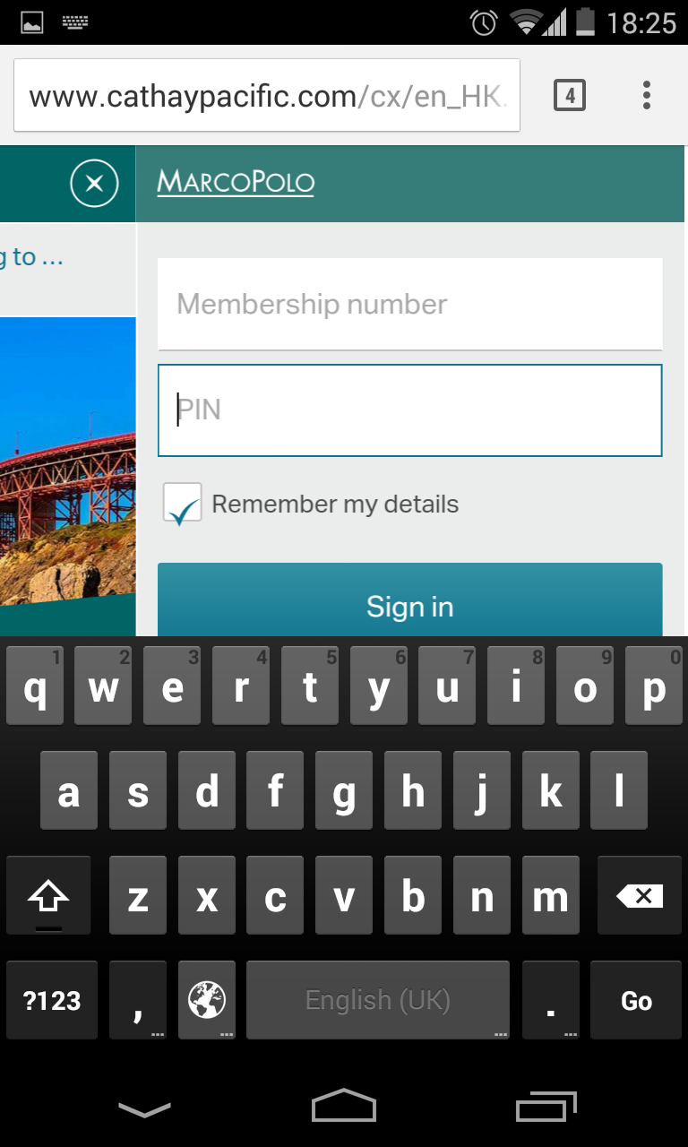
Also, the keyboard stay alphanumeric even if I’m asked to enter a PIN… <input> without the pattern attribute…
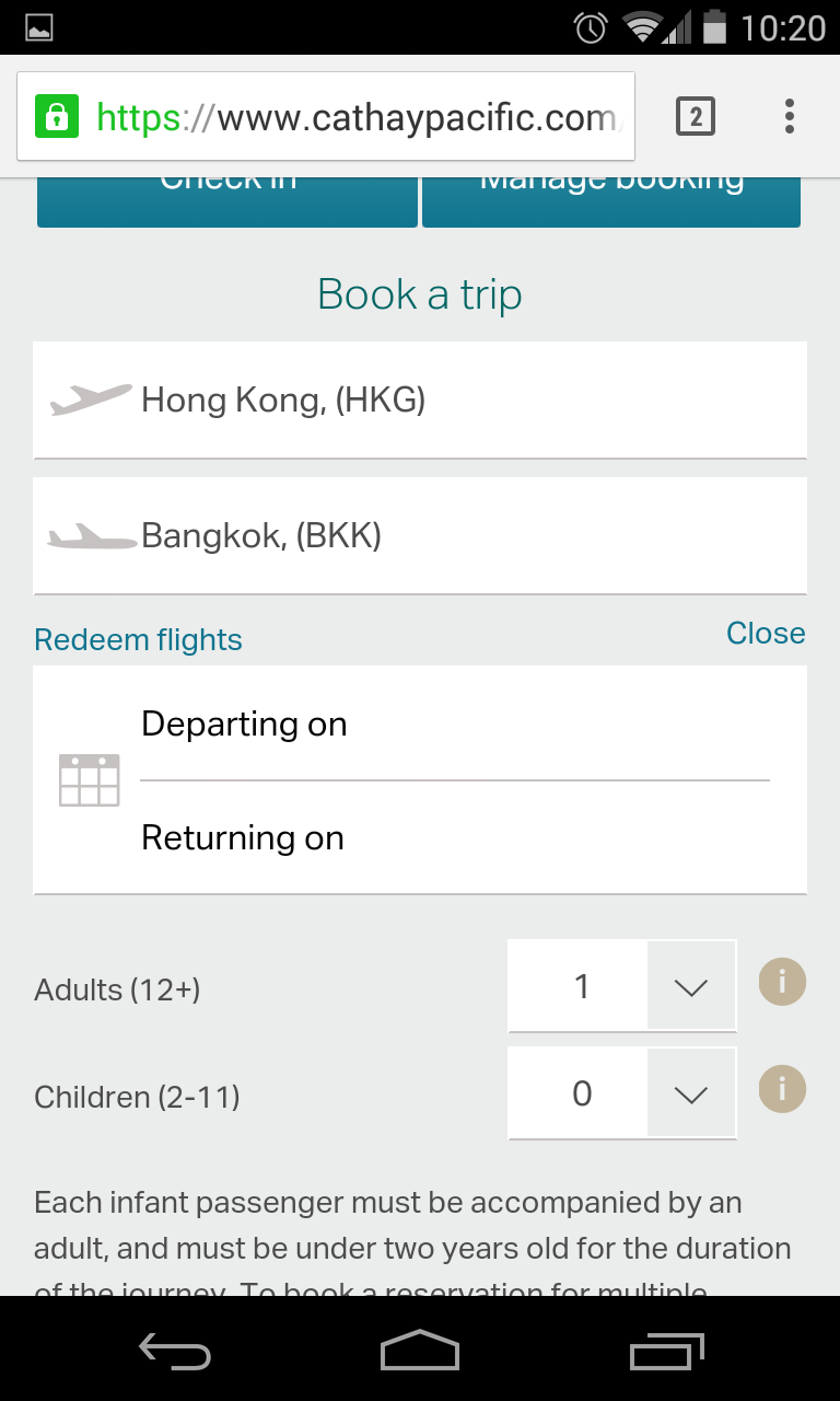
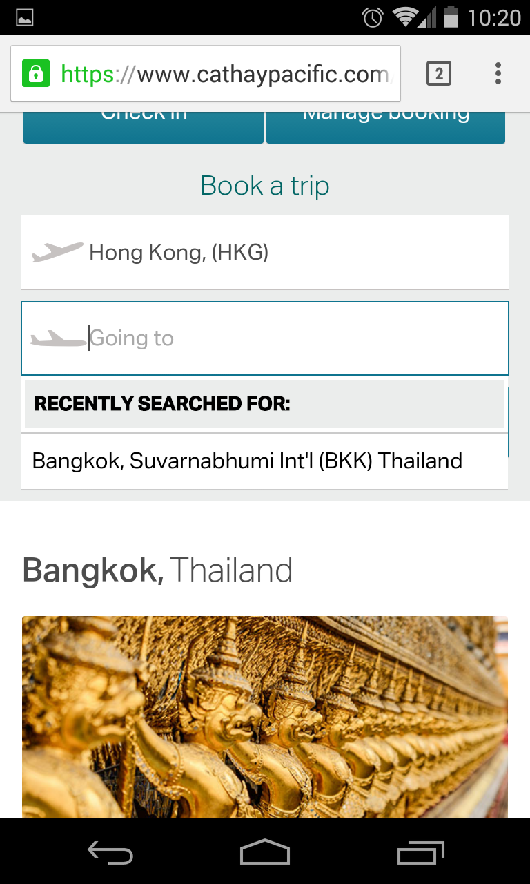
Let’s move to the booking part. A short scroll down, and I can insert departure and destination airport.
All good, also the suggestion of any previous search. I like the fact that the date form element and other details (number of travellers, etc) appears after I select the destination… unclutters the homepage.
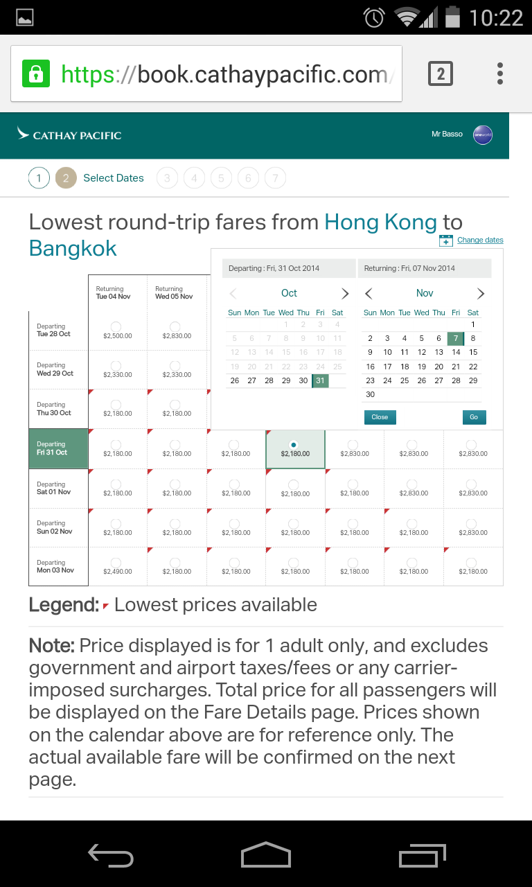
However, a main issue happens on the datepicker. When I tap on one of the two date fields, either Departing on or Returning on, the datepicker Confirm button is visible only if I scroll down.
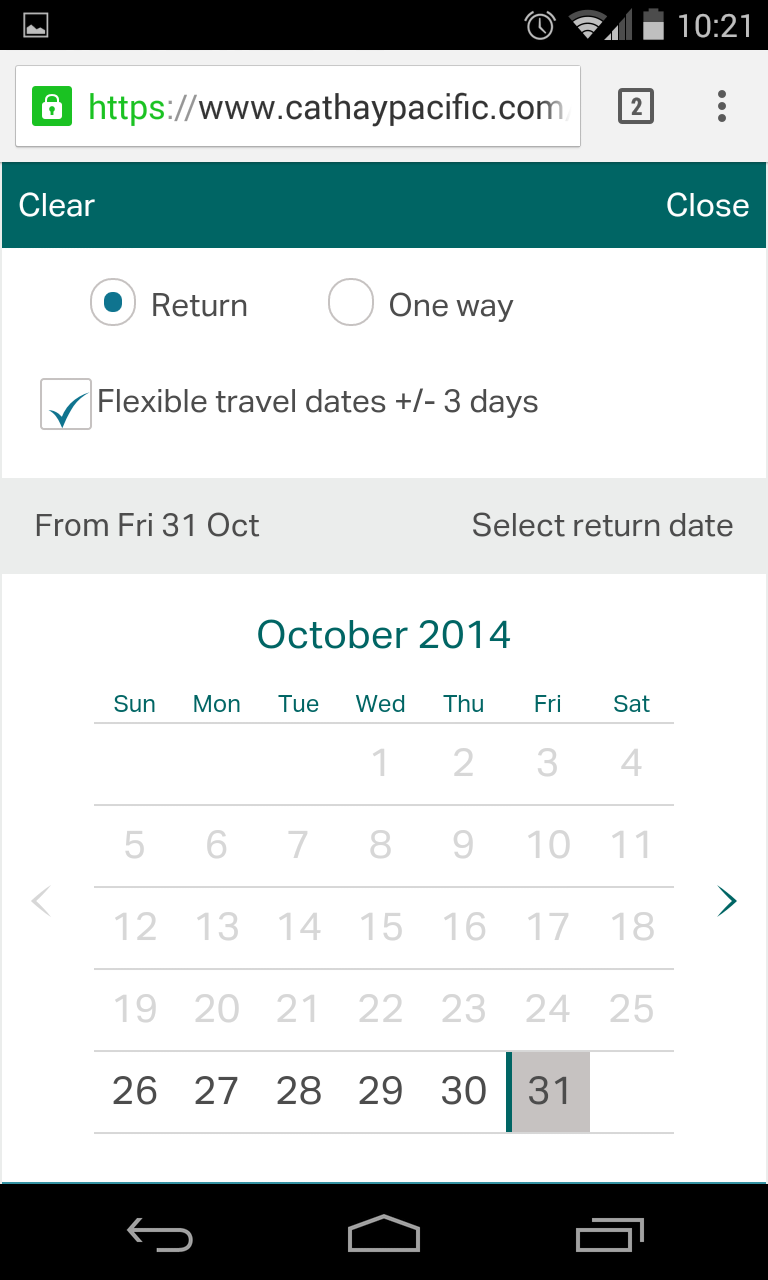
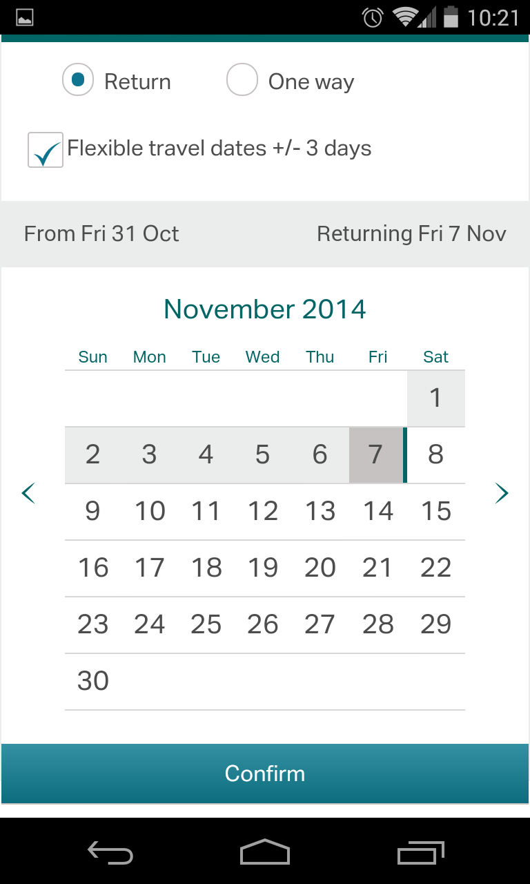
This is not because the datepicker is bigger than the viewport, but because it is anchored to the date fields. This may be a deliberate choice, to allow the customer to modify the values for “return/ one way” and “=/- 3 days”, but the result is confusing, because the user doesn’t immediately see the Confirm button, and so his “way out” of the datepicker.
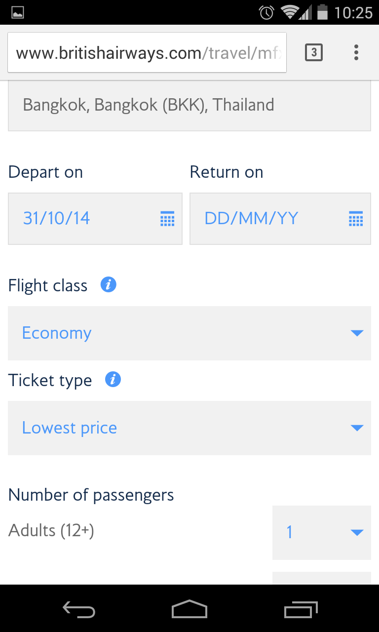
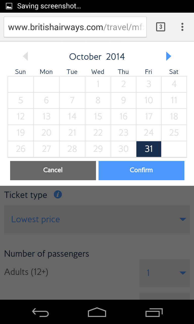
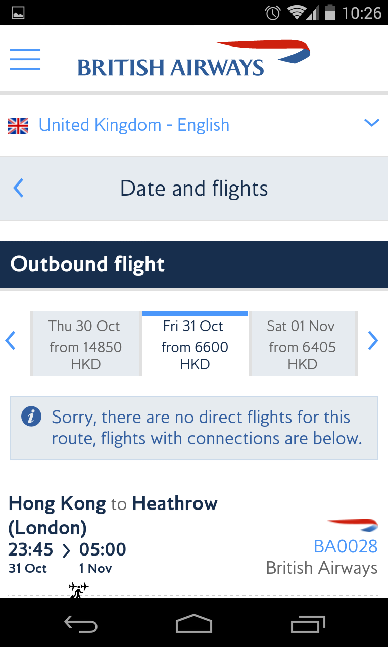
If you compare it with another website, for instance ba.com, the datepicker is anchored to the top of the screen, and it’s modal. Confirm and Cancel are clearly visible.
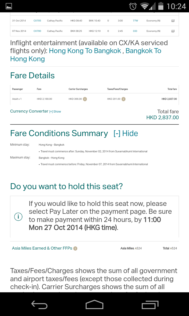
The biggest disappointment happens when you click Search flights: the second screen (and all the subsequent) is not mobile optimised. Although text is displayed with a font size suitable for mobile, the datepicker does not adapt to the mobile form factor, nor does the price summary.
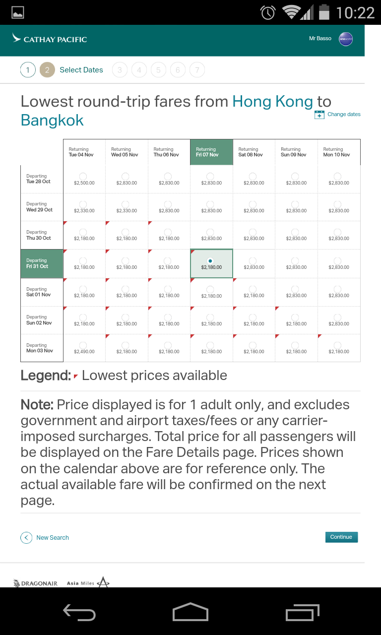
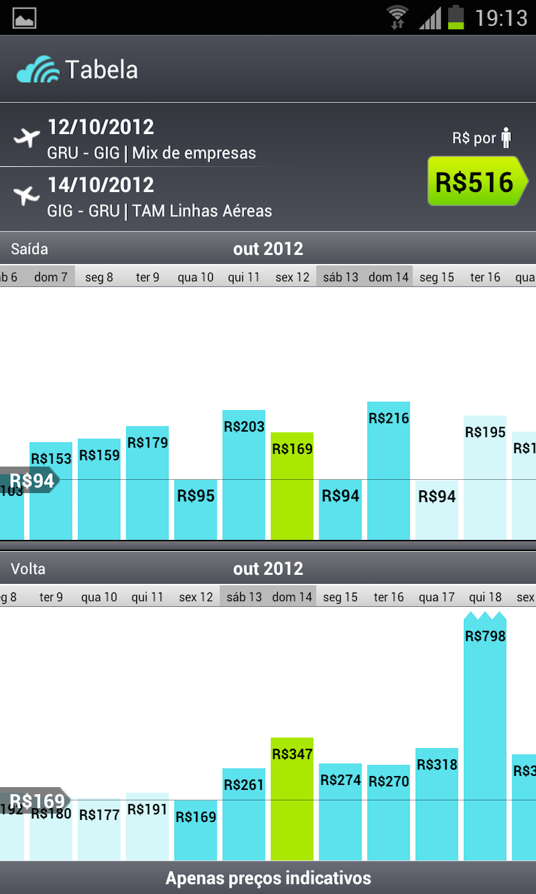
Back to ba.com for a moment, the way the search results are presented is mobile optimised: if the intention was that all price options are clearly visible on one screen, there are other types of view that could have been better suitable for a mobile screen, like the skyscanner one:
All subsequent screens on the booking journey are not mobile optimised.
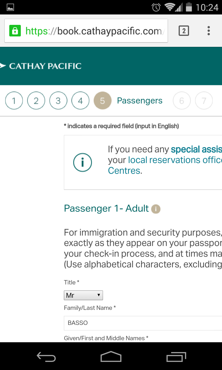
Is it a deliberate choice? I don’t know. Surely, a customer who starts a booking on a mobile, expect the experience to be consistent. I can only imagine a very high abandonment rate, especially considering that it is still not possible — at least on android — to book using the Cathay Pacific mobile app.
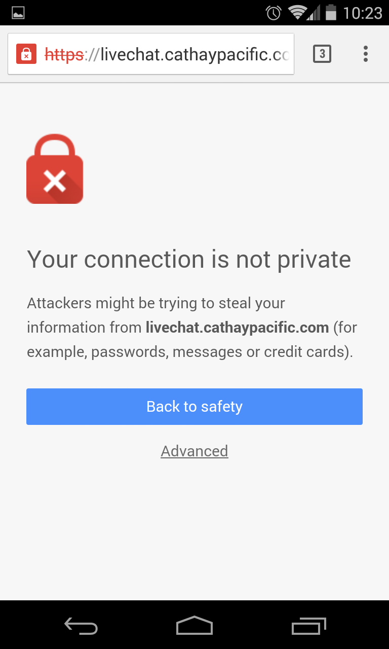 Update: it seems there is an issue on the live chat functionality, the one that allows to get in touch with a staff member to get support during the booking process.
When the user taps on the “live chat” icon, a new browser window opens, but Google Chrome shows the certificate not valid message.
The certificate is indeed signed by a valid CA, but Chrome mobile shows the red open lock… Chome for desktop reports an error as well, albeit without the red lock icon.