Cathay Pacific, mobile app
11/Dec 2014
Few days ago, Cathay Pacific released its new mobile app.
I downloaded the android version, and gave it a try. TL;DR? It’s better than it used to be, looks more modern, but there are a number of bugs still open, and questionable design chooices have been made. Here are a few comments.
Two different loading spinners: why?
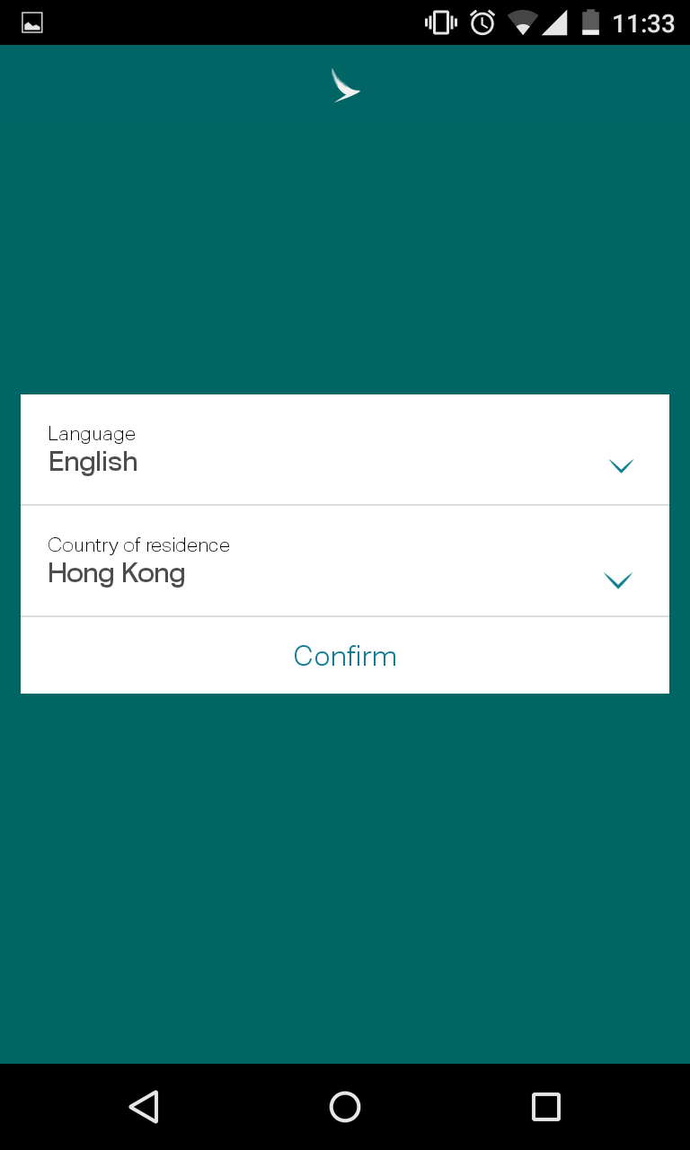
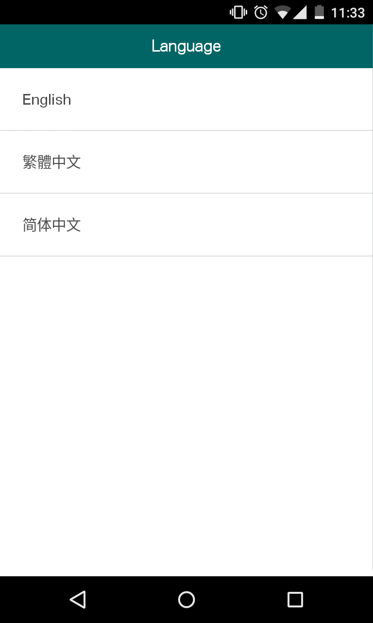
Page transitions (see below an example of the language selection) are ok, but the “back” button should animate from left to right, not right to left. In the app all transitions animated in a screen presented right to left, which is kind of counterintuitive if happens in response to a “back” action.
On the login page, the button state changes to “active” only if I tap “enter”, not if I dismiss the keyboard somehow else (like, tapping on some other elements in the interface, the tick, or just the dismiss button on the keyboard…)
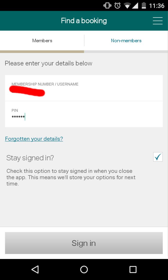
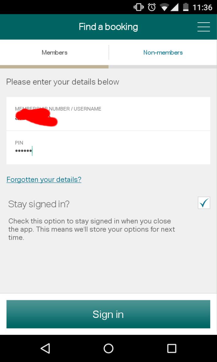
Seems I can’t search for bookings once logged in, just view the ones already associated with my Marcopolo account.
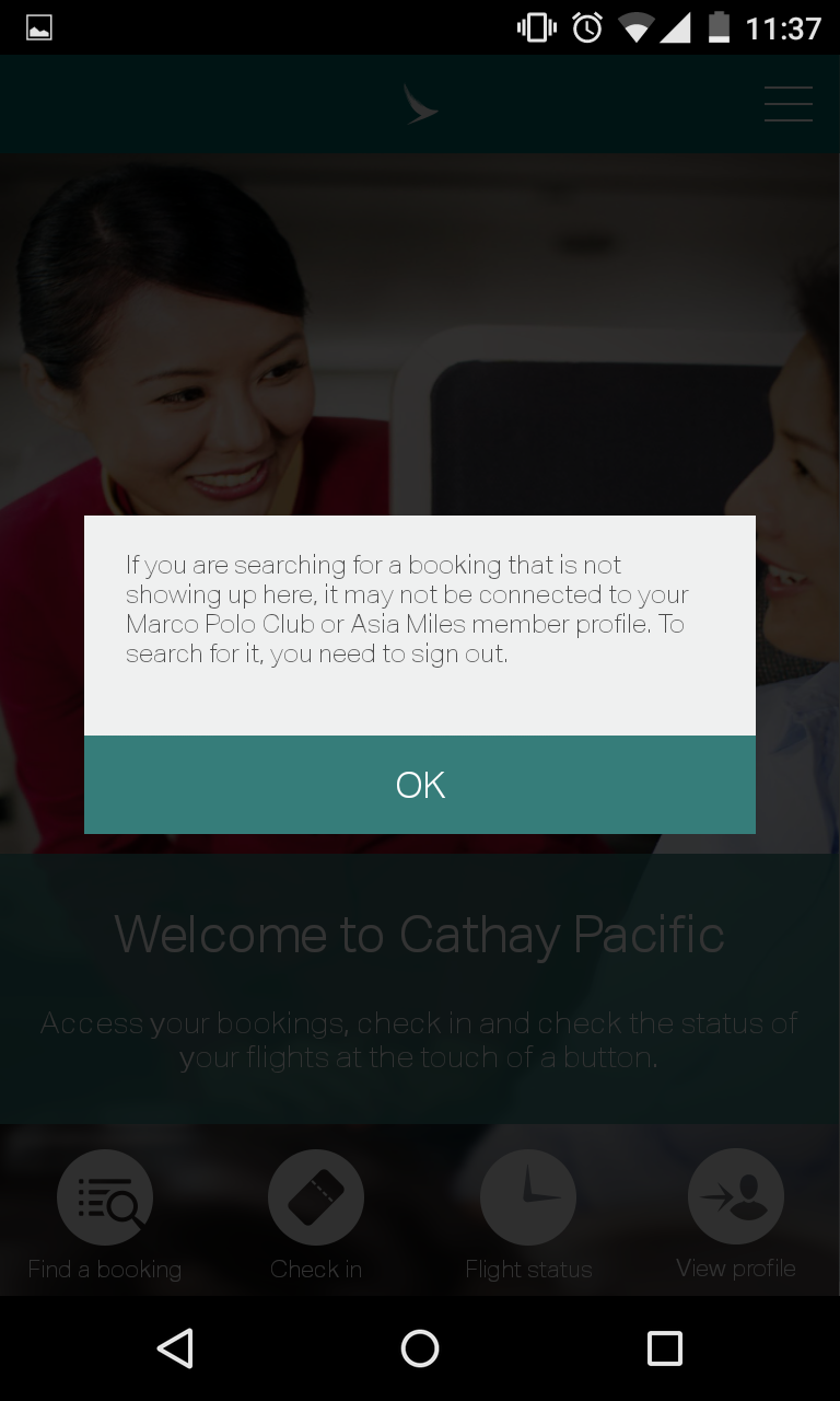
Why? Doesn’t make much sense… I would expect I can search a booking by code, and then have a nice button “add to my bookings” if not already…
When I do search for bookings, you tell me I have to LOGOUT to show it?
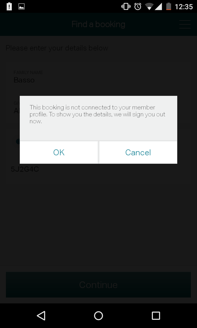
Make very very very little sense. Except… you are not really logging me out. I still see logout and settings link in the side menu, but some buttons on the home screen (“view profile”, for instance) do not work. Tap, nothing happens…
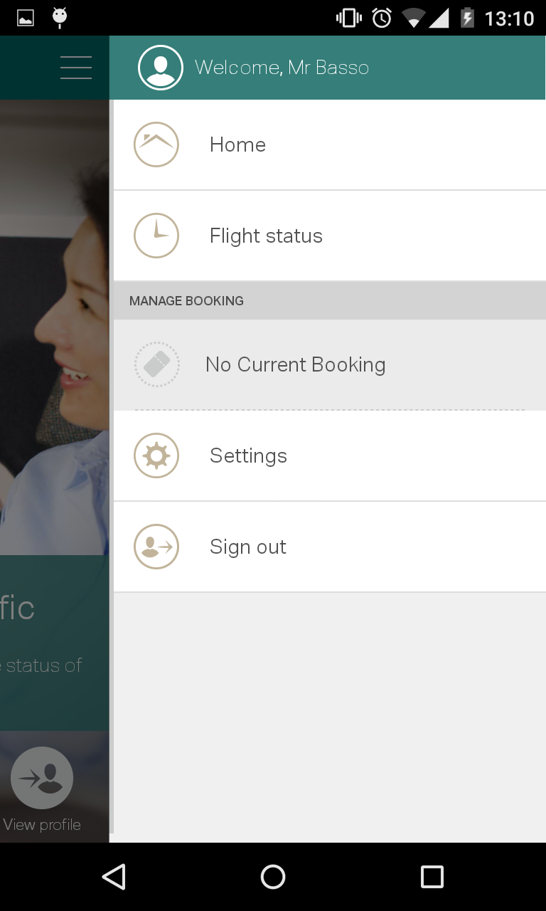
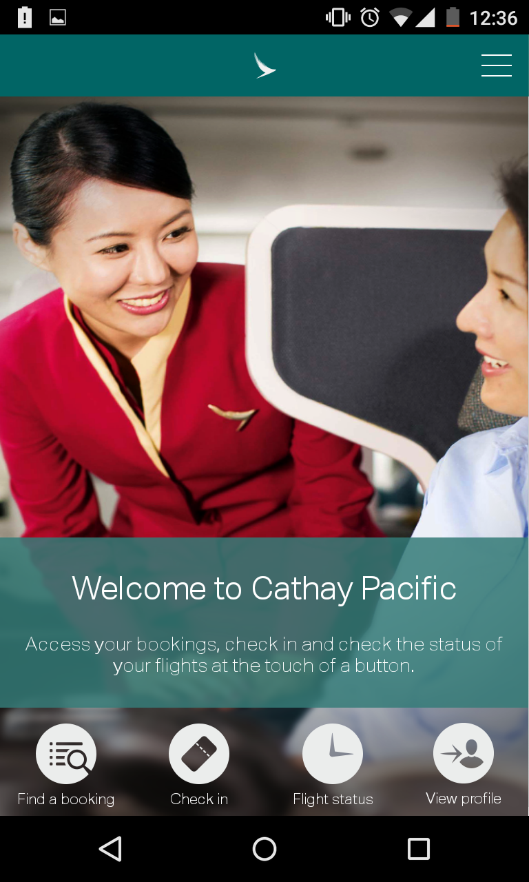
When I then logout and re-login… “OK”. What does that mean? :)
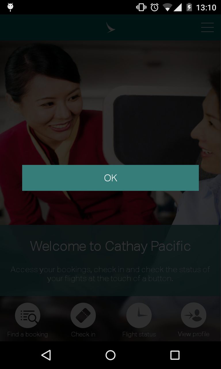
All the above after using the app for no more than 5 minutes… still haven’t tried the online checkin, mobile boarding pass and seat selection. I am sure these features are amazing, but the very first impression of the app is sloppy and rushed into production.
Plus, some functionalities are really not making sense (logout to view bookings?!??). And I still can’t book a ticket via the mobile app!!
Come on, “world best airline”, you can really do better!
